
2022/23 Serie A Kit Rankings
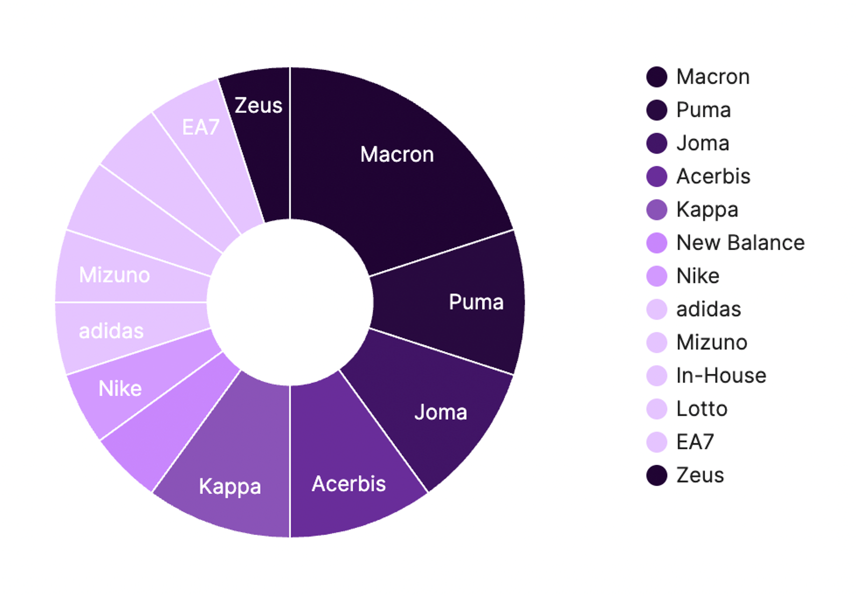
With the new Serie A season already back in full swing, it’s now time for football’s most important analysis – kit rankings. Once again, the fashion capital of the world boasts more different shirt suppliers (this time 13) than any of Europe’s other top leagues, which usually ups the level of creative diversity seen on […]

With the new Serie A season already back in full swing, it’s now time for football’s most important analysis – kit rankings. Once again, the fashion capital of the world boasts more different shirt suppliers (this time 13) than any of Europe’s other top leagues, which usually ups the level of creative diversity seen on the pitch. That being said, it looks like we’ve gotten an underwhelming crop for the Italian top flight this time around (RIP Venezia).
Nevertheless, here is an official Foot Italia review, from worst to best, of every Serie A home jersey for 2022/23.
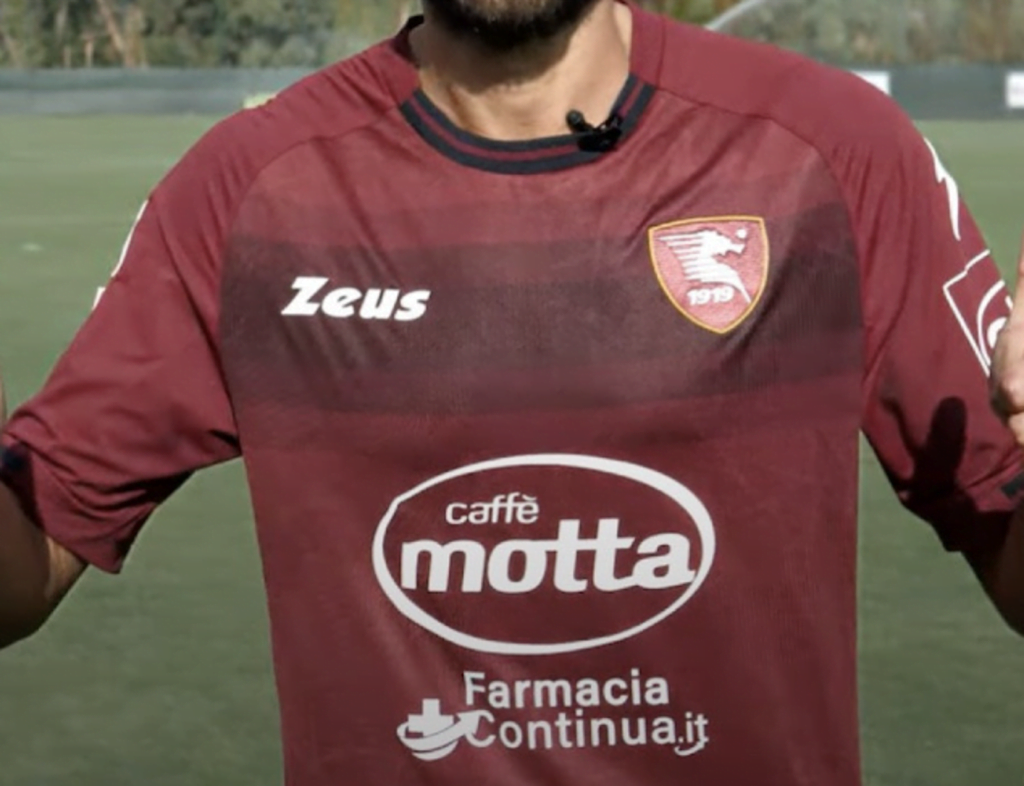
#20 – Salernitana
After a miraculous survival last year, Salernitana return to wear another day. But with little other identity to speak of, if the seahorse wasn’t in view, you’d be forgiven for thinking they were Torino jerseys.
Zeus replacing the previous collar with a band that only covers half the neck, and inexplicably setting the dark shading so that their logo and the badge aren’t centered within it, make this an embarrassingly lazy effort.
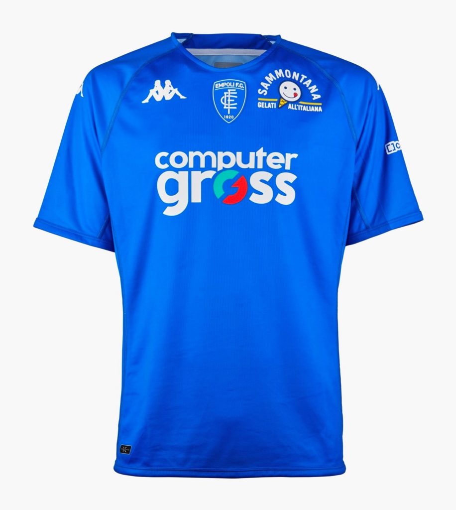
#19 – Empoli
Apparently Kappa was so focused on churning out bangers for Venezia that they forgot to draw something up for Empoli until the night before. This uncharacteristically boring result disappoints more because we know what they’re capable of.
It also feels uncomfortable for such a club-badge-esque shirt sponsor to be where the badge normally goes, though a smiling ice cream cone could make an amusing crest, to be fair.
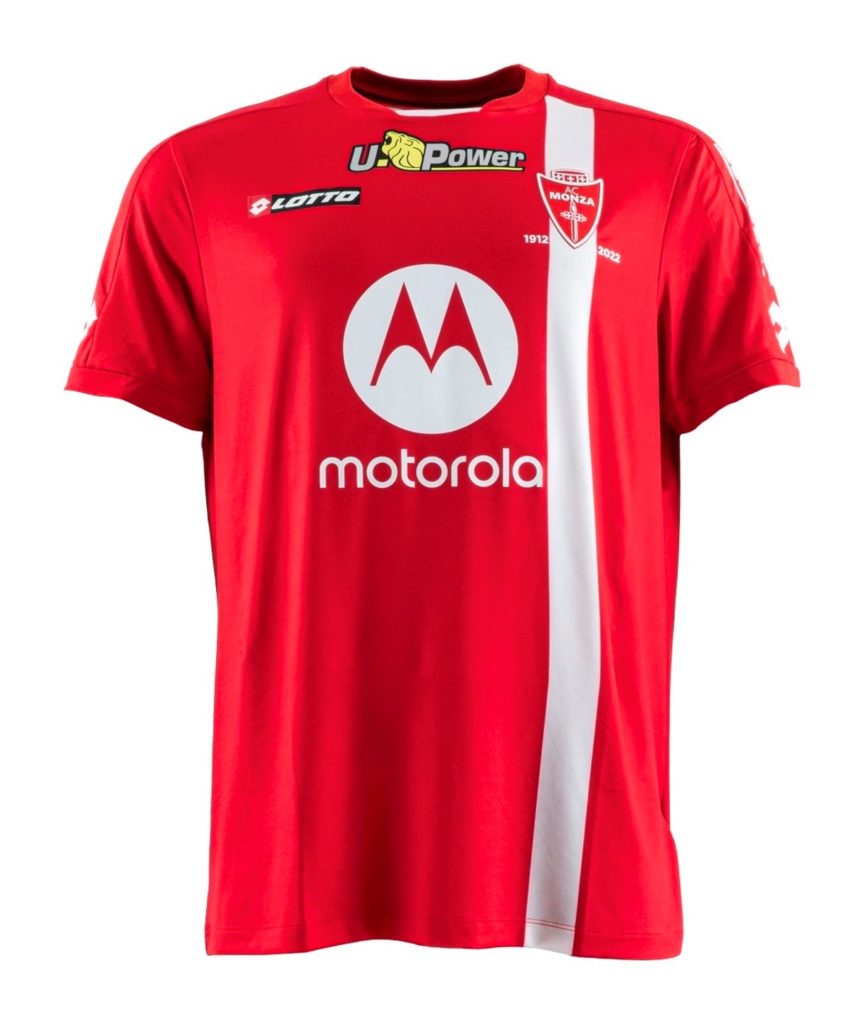
#18 – Monza
Once a powerhouse of calcio kits, Lotto now has only one club in Italy’s top three tiers – lowly Monza, who celebrate their Serie A premiere in their 110th anniversary season.
As the film/tv trope goes, those wearing red often get killed off first, and our humble debutants already find themselves rock bottom of the table.
If you squint, the single stripe could vaguely symbolize the sword in their badge. They’ll need every weapon they can get.
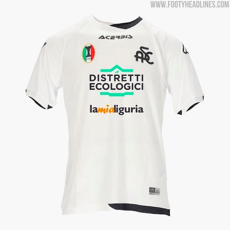
#17 – Spezia
In 1911, Spezia chose white shirts because they wanted to emulate Pro Vercelli, who had the reputation of being a small club that could beat the big names. As underdogs who’ve lived to fight another day, this remains relevant.
Unfortunately, removing all the little details that made 2021/22’s so classy means all that’s left is that lower-league-blank-canvas-for-multiple-corporate-logos look.
Their special tricolore patch on the right, however, is still proudly displayed. Meant to symbolize a mid-war replacement league trophy earned in 1944 that wasn’t recognized as legit until 2002, you have to admire their absolutely steadfast dedication to milking it. Just world class pettiness we can all get behind.
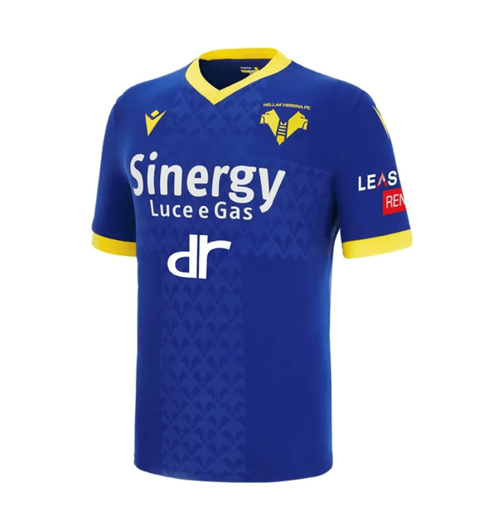
#16 – Hellas Verona
It’s alright, but rather unremarkable for Verona, who have had some more interesting editions in the past.
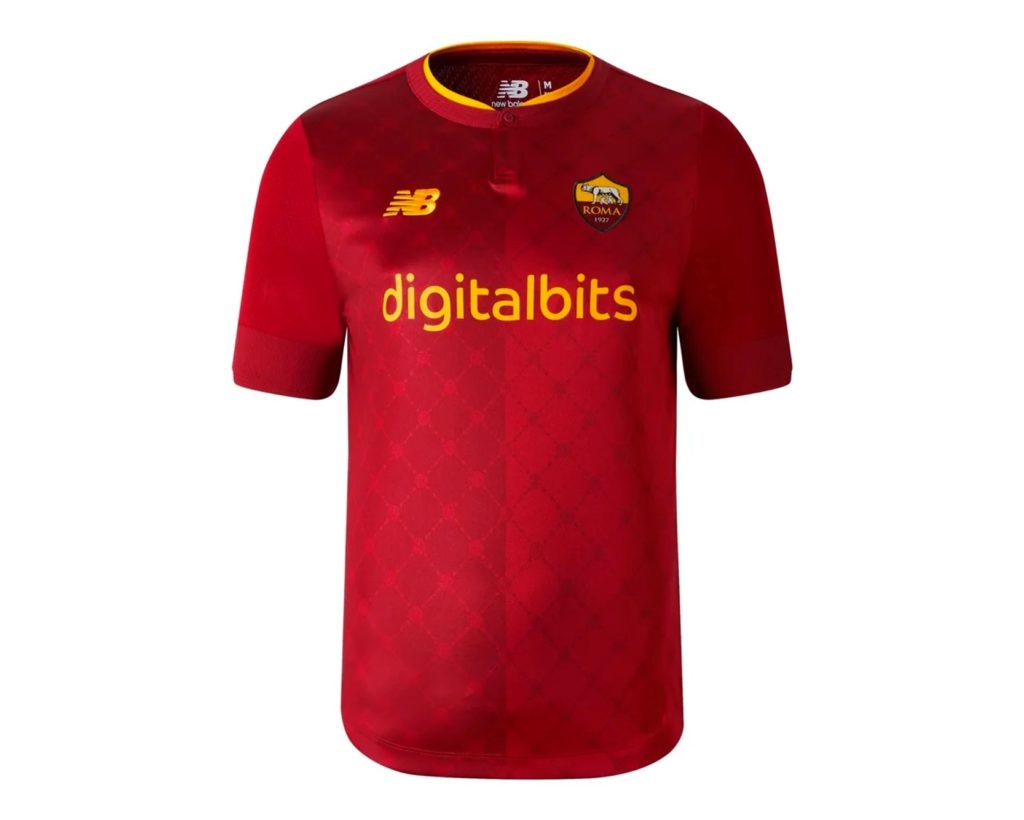
#15 – Roma
The company that makes your dad’s shoes has branched out into making very mediocre shirts for a club that usually sports some gorgeous designs.
It’s difficult to fail completely with Roma’s compelling colors, but that makes this missed opportunity feel even more like a letdown. The faint watermark effect just makes the players look like they’re slightly sweatier on their right side.
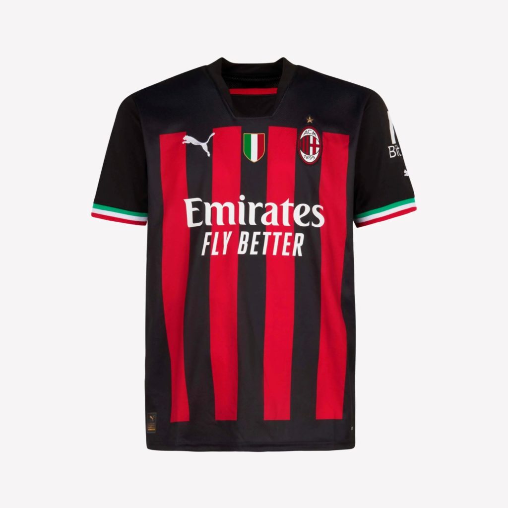
#14 – Milan
While the tricolor sleeve openings mirroring the hard-fought scudetto patch is a nice touch, the truncated stripes make this feel awkward and boxy, as if they were incompletely painted over a black shirt. The collar is also an odd decision that seems to halfheartedly continue Puma’s bizarre obsession with faking undershirts. Champions deserve better.
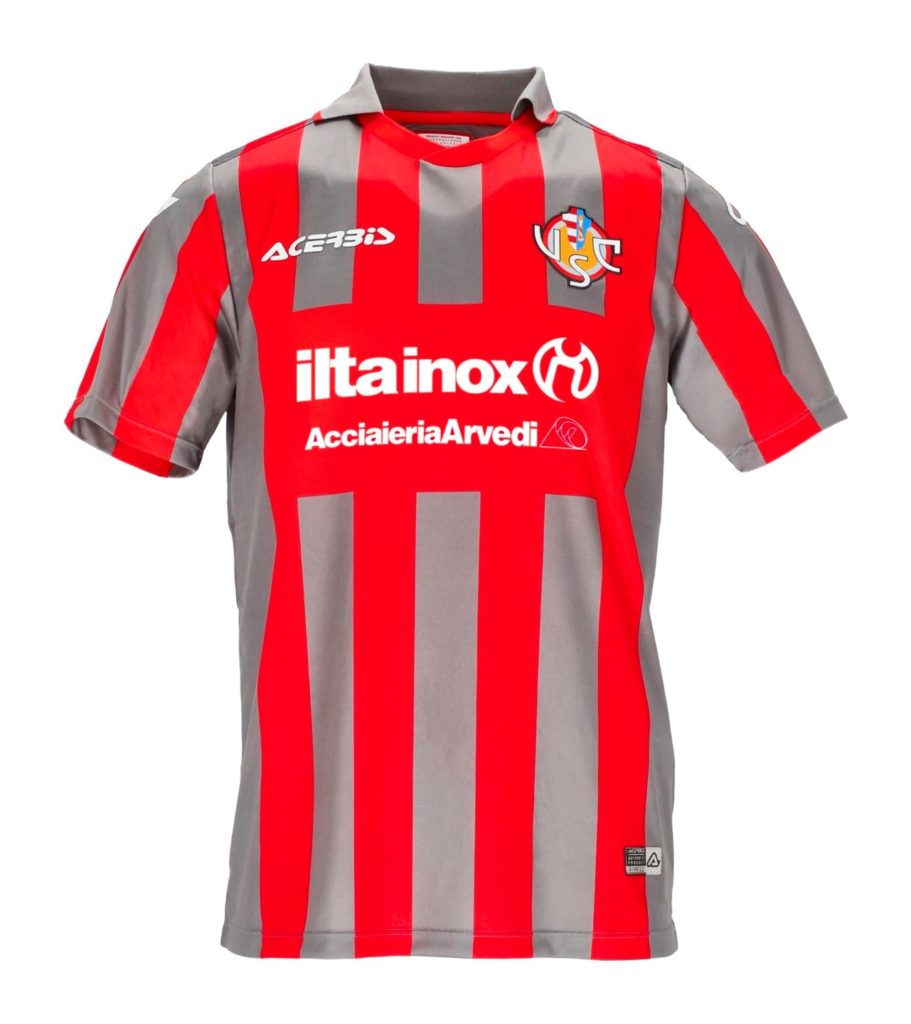
#13 – Cremonese
Let’s be honest, it looks like someone put strips of duct tape over a red jersey. That, or you’re watching the one colorblind accessible TV in the bar.
I Grigiorossi colors aside, the collar and smart simplicity are an homage to what Cremonese wore last time they contested Serie A (they survived three seasons in the ‘90s), and those were actually quite nice. Respectable, but perhaps a missed opportunity for some real retro pastiche.
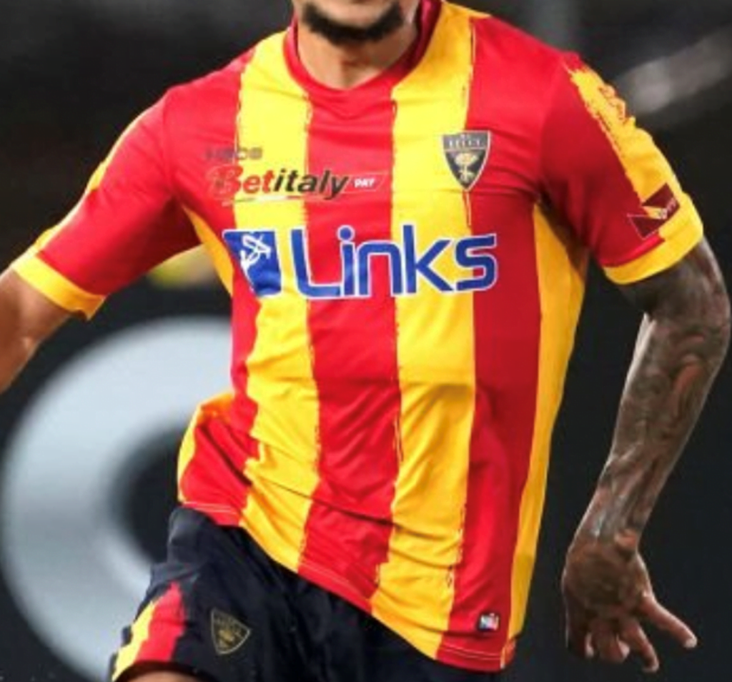
#12 – Lecce
For their return to the top flight, Lecce is producing their own shirts. Most striped clubs eventually go through a brushstroke phase – the bright Pugliese are no different, and the result is actually quite nice.
Being red, the collar blends in with the center stripe, though, and would benefit from the consistency of matching the yellow rings around the sleeve openings instead.
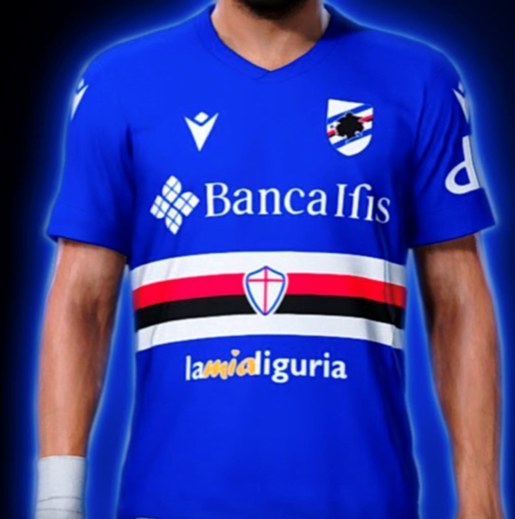
#11 – Sampdoria
Few clubs change their design from year to year less than Sampdoria, but few clubs have such a unique structure to their jerseys to preserve.
The classic blue base remains split by the white, red, and black hoops that signify the original two teams that merged to form this one. But trying to cram two shirt sponsors together as well is one combo too cluttered.
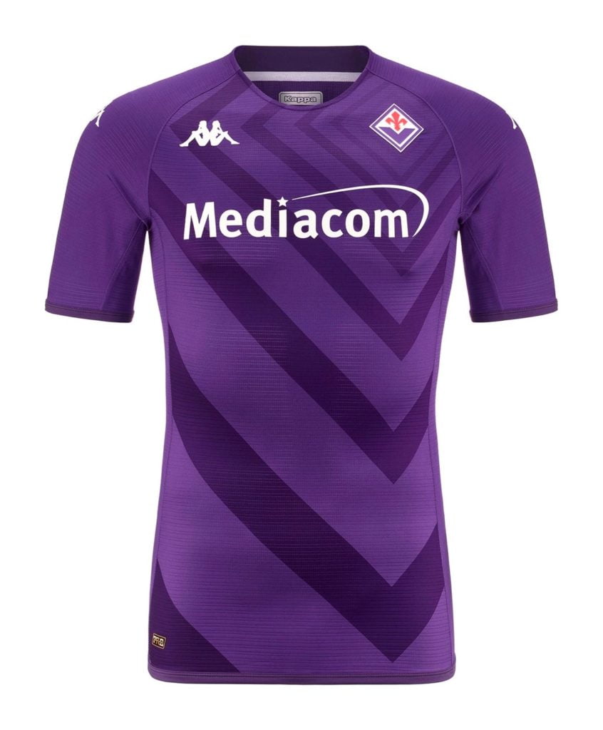
#10 – Fiorentina
To highlight their new diamond badge, Fiorentina’s classically bold purple is broken up by radiating ripples emanating from the crest for an effect that also mimics the chevron inside it.
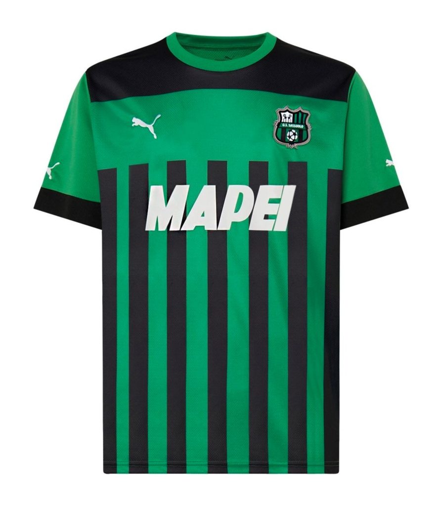
#9 – Sassuolo
With non-home green jerseys now banned, Sassuolo will stand out even more from this year forward.
Breaking the stripes off for two horizontal bands at the top makes this feel like two different ideas smashed together, but it’s worth a try, I suppose.
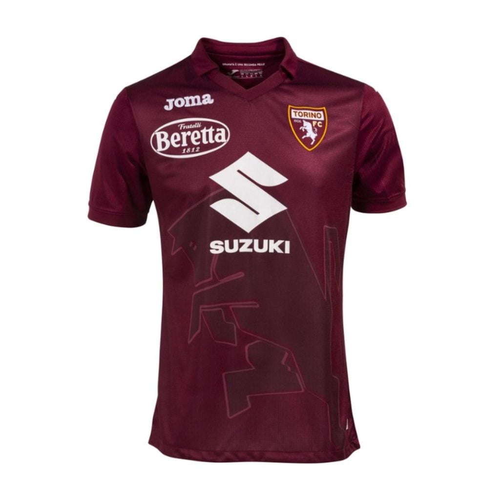
#8 – Torino
The bull is back!
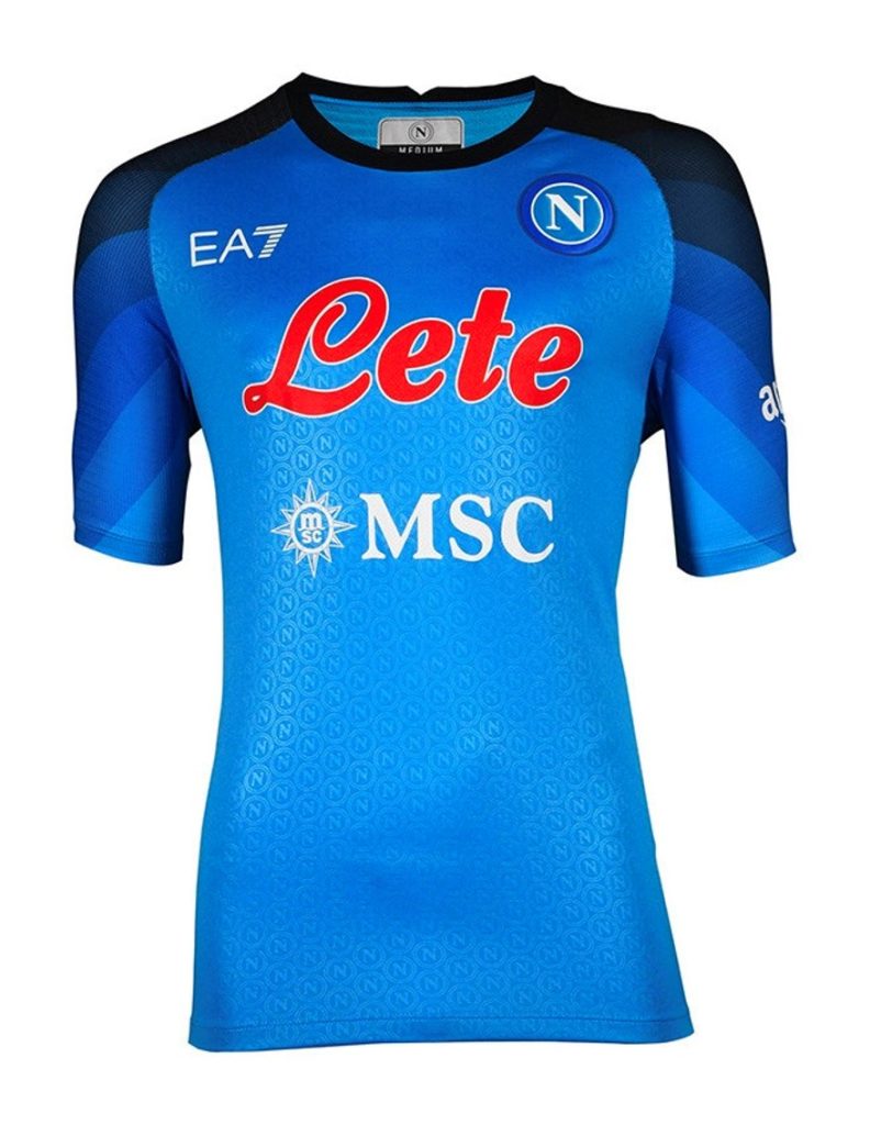
#7 Napoli
Last year, Napoli practically had more individual kit designs than players, and this year they’re rumored to be doing it all over again.
If they focused more on quality than quantity, EA7’s shirts would probably come closer to the heights Kappa scaled before. But this effort is at least more interesting than the Armani brand’s 2021/22 debut, and not bad overall.
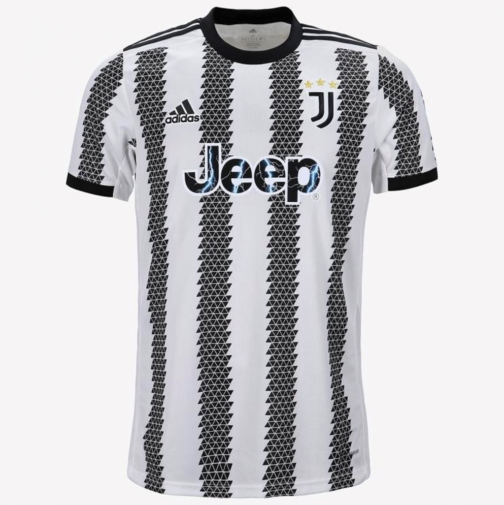
#6 – Juventus
After a refreshingly solid effort last year, Juve’s template is back to being a bit overwrought – their stripes already tend to feel cluttered clashing against Adidas’ own three tacked on.
Without the triumphant color splash of a trophy patch for the first time in over a decade, there’s a lingering emptiness. The serrated stripe edges hearken back to the last time Juve’s chests were bare – 2011/12, when they won the first Scudetto that kicked off that now-defeated dynasty.
That was also the last year we got full-bodied stripes forming an unbroken design topped by a golden nameset instead of this big blank box on the back and sides. That fluidity is missed.
Still, it’s started to grow on me.
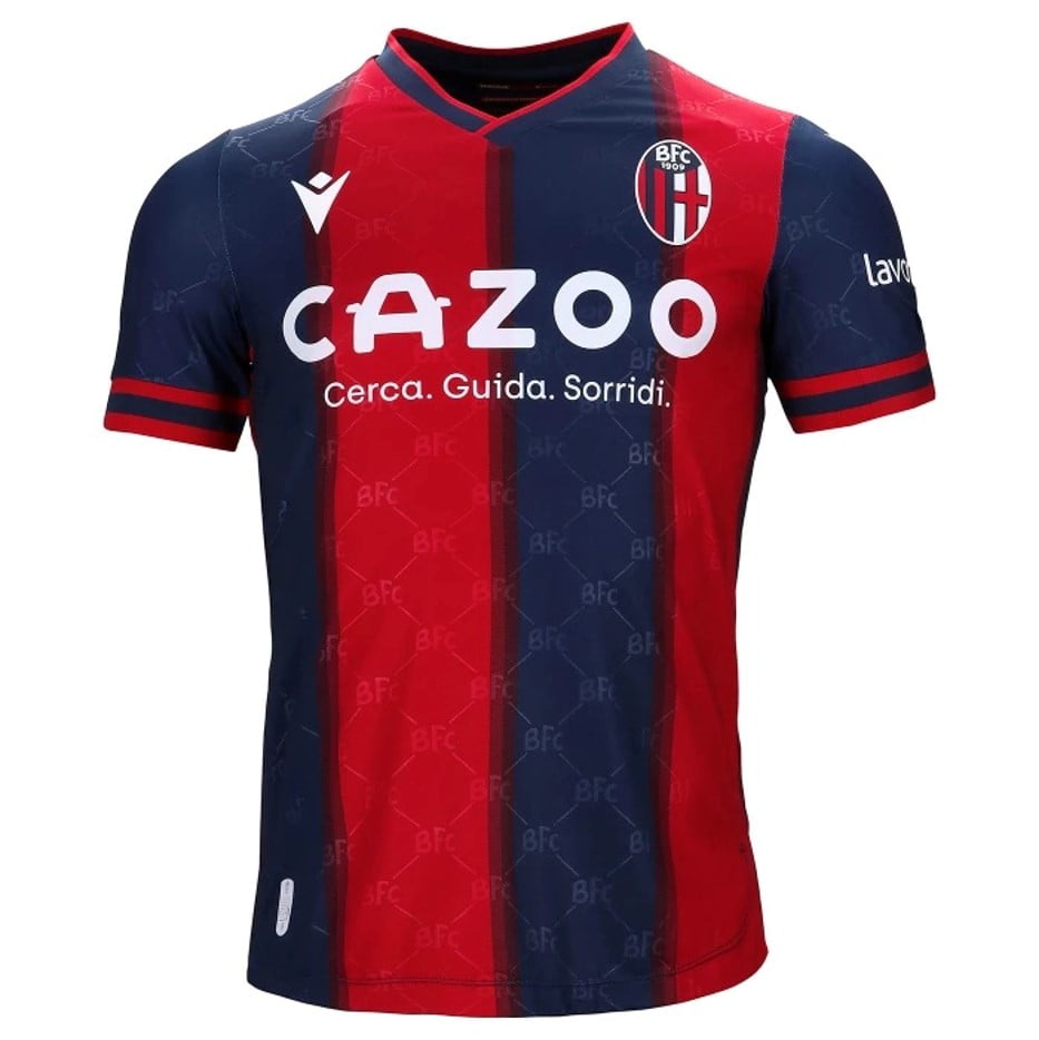
#5 – Bologna
One of the few clubs still working with a kit supplier from their own city, Macron have been a Bologna mainstay for over two decades.
The BFC watermarks and the chemical bonds they seem to be forming add a hint of ‘90s nostalgia, while the collar and sleeve openings are sharp. The back even includes a subtle tribute to the little-remembered Mitropa Cup they lifted 90 years ago.
But the real talking point is the shirt sponsor. Those who understand Italian, or at least remember the particular part of it their nonno used to shout, will know why.
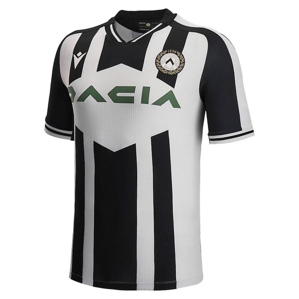
#4 – Udinese
Frankly, I’m a bit baffled by the giant diamond-shaped hole left for a thin, horizontal shirt sponsor that isn’t even centered (though there is some history in it). But this jagged, angular aesthetic still meshes well enough overall, and is well punctuated with clean accents around the openings.
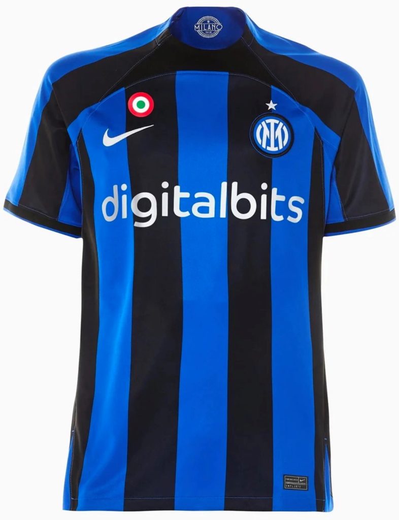
#3 – Inter
When this jersey first leaked, it looked pretty bad.
But, as is often the case, the final product turns out much better on the players than it seemed slumped in a blurry sports store (even if the collar still appears a bit uncomfortably tight). Unlike their Big 3 rivals, Inter’s stripes uniformly cover the entire kit, so they finish on top.
The only real complaint on an otherwise bold and coherent kit is the Coppa patch. What are they thinking?
It should go centrally on the shirt, but instead it’s haphazardly thrown on in such a way that it’s not centered above the Nike swoosh, in a stripe, or between two. I didn’t go to design school, but I imagine this is some sort of cardinal sin.
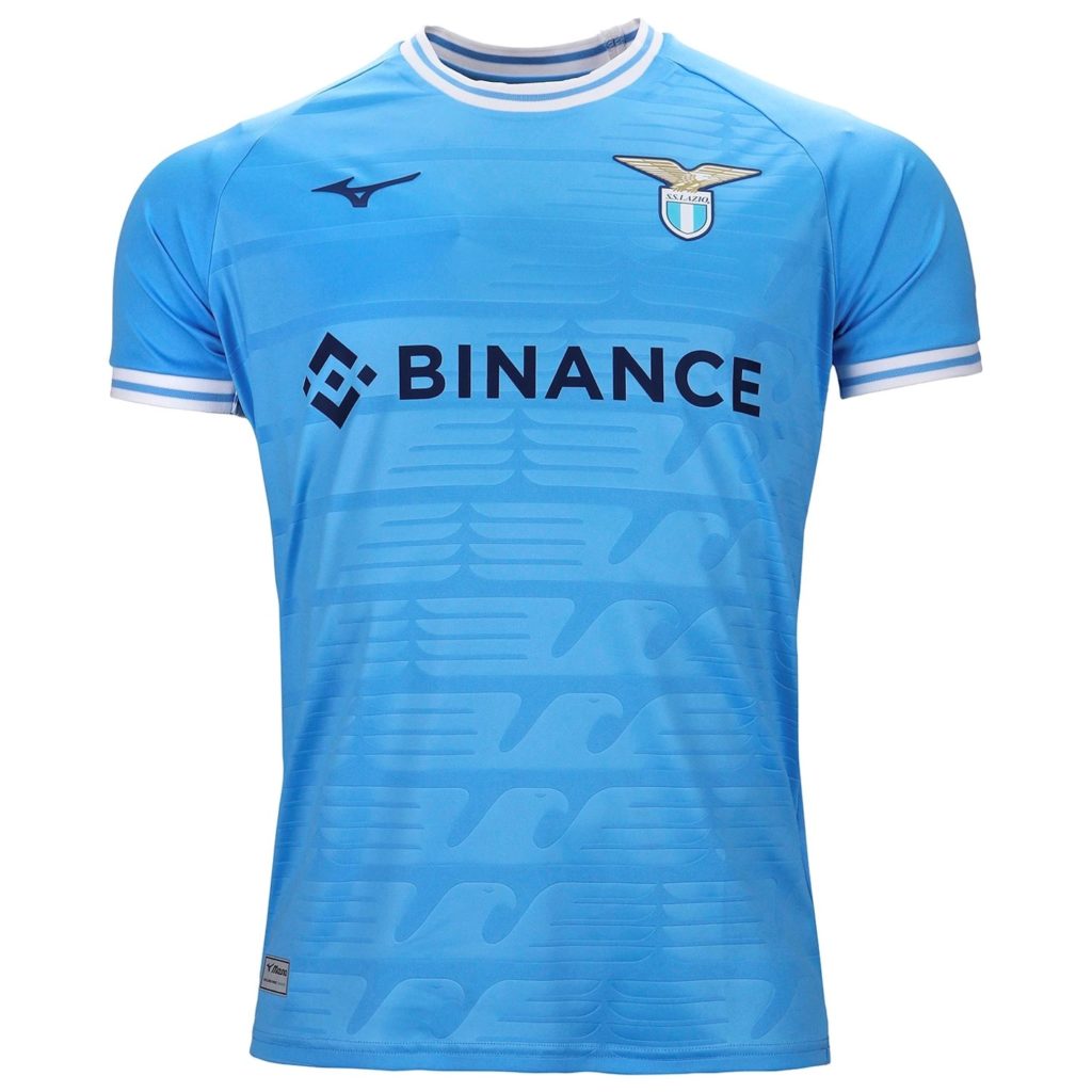
#2 – Lazio
This vibrant sky-blue is filled with a flock of eagles that hint at some bangers worn before.
The rest? Flawless restraint.
Like the shirts worn by Lazio’s crosstown rivals, these were created by a brand best known for shoes. Mizuno, however, have taken the better first step.
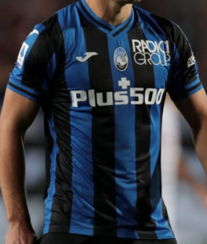
#1 – Atalanta
Nice, classic stripes work when they work. And they’re working for Atalanta.
Atalanta’s lovely crest slotting snug within a center stripe lends this timeless look just the touch of character needed to make it feel like a quiet standout amongst the bunch.
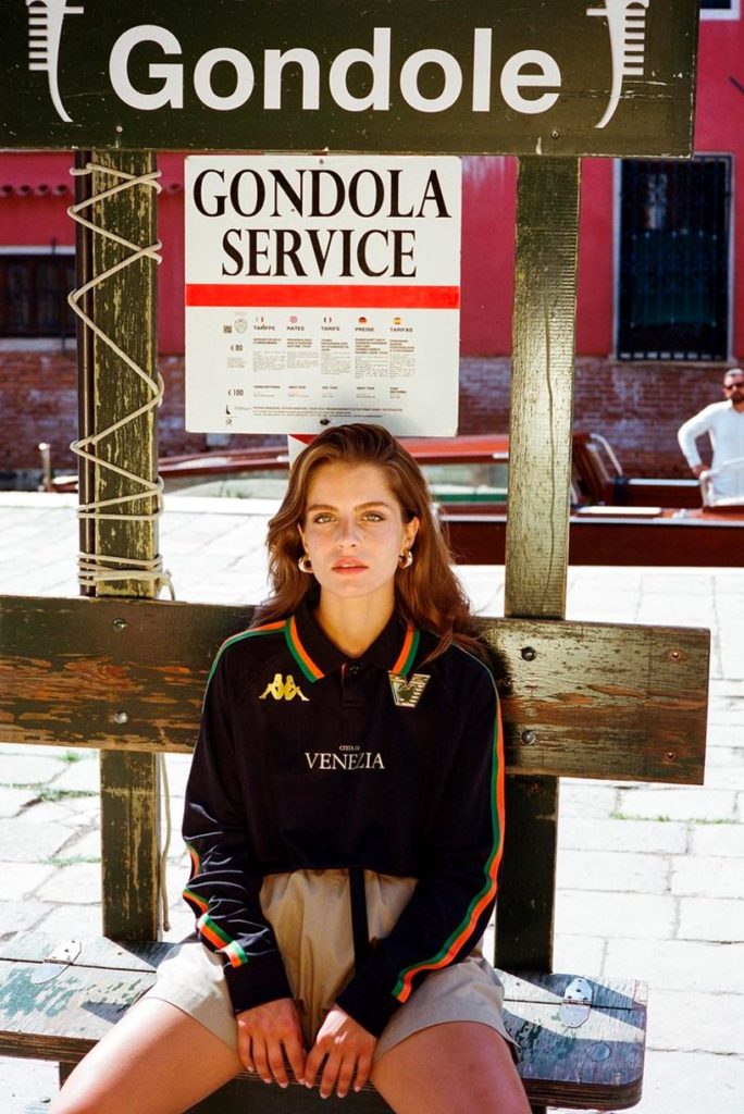
HONORABLE MENTION – Venezia
It turns out the most beautiful kit in calcio isn’t in Serie A at all! Better known for their style than their football at this point, Venezia will be stunning Serie B in simply gorgeous fashion.

Our unbiased editorial policy
Despite ongoing collaborations with commercial affiliates, the details, information, and reviews we provide remain honest and unbiased. We keep this in check by implementing a stringent editorial policy.
Our policy implements strict editorial standards, ensuring the integrity and trustworthiness of our articles, news, and reviews. Only the highest-quality content reaches our pages. We achieve this through conducting thorough research on each topic, conveyed to you using unbiased reporting, to ensure we earn your trust and keep it.


